Intro
Intro
Here to Help New Parents
When a new baby is born, parents are faced with countless new responsibilities and decisions. The fear of missing something important—or making the wrong choice—can create significant stress. If a baby’s needs aren’t met, the consequences are serious.
This was how My Lil Boo was born.
My Lil Boo is a responsive website designed to help help new parents build confidence as they care for their babies. By tracking daily habits and offering guidance on baby health and wellness topics, the platform supports parents through the early, often overwhelming stages of parenthood.
Intro
My Role as a UX Designer
Competitive Analysis - Usability scripts - User interviews - User testing - Analyzing feedback - Prioritizing features
Research
Branding - Sketches - Wireframing - Prototyping - Mid-fidelity - Hi-Fidelity - Final product
End-to-End Design
Project through UX/UI Academy, 5 week timeline
Project Overview
Sketchbook - Zoom - Maze - Figma - Group critiques - Mentor Feedback
Tools and Resources
Research
Tools to Help Parents
I viewed four competitors: Baby Center, Huckleberry, Le Baby, and Sprout

Strengths
Description of current month milestones
Use of customizable trackers
Use of customizable trackers
Option to add multiple babies
Simplistic layouts
The use of guides
The use of guides
Habit analysis
Weaknesses
Certain apps included only trackers and no insights or guides, and vice versa
Missed opportunities when it came to using cute colors
Research
Tools to Help Parents
I viewed four competitors: Baby Center, Huckleberry, Le Baby, and Sprout
Strengths
Description of current month milestones
Use of customizable trackers
Option to add multiple babies
Simplistic layouts
The use of guides
Habit analysis
Weaknesses
Certain apps included only trackers and no insights or guides, and vice versa
Missed opportunities when it came to using cute colors

Baby Stories Straight From the Source
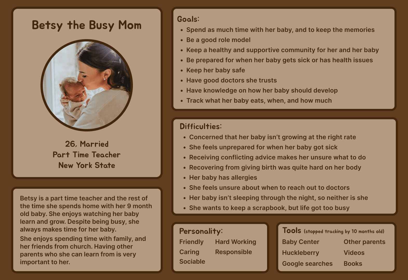
I interviewed five parents of 12 months old or younger to better understand their needs and concerns.
Parent's primary concern is their child's health and safety, such as…
Growing and developing at the right rate
Illness
Allergies
Baby proofing
Growing and developing at the right rate
Illness
Allergies
Baby proofing
Therefore it was of the upmost importance that parents have trusted healthcare providers and knowing when a concern is serious enough to contact a doctor.
Baby Stories Straight From the Source
I interviewed five parents of 12 months old or younger to better understand their needs and concerns.
Parent's primary concern is their child's health and safety, such as…
Growing and developing at the right rate
Illness
Allergies
Baby proofing
Therefore it was of the upmost importance that parents have trusted healthcare providers and knowing when a concern is serious enough to contact a doctor.
Define
Healthy Babies, Happy Parents
Prioritized Features chosen to support and help new parents
Guides and articles to give parents quick access to reliable health and development information
Customizable health and habit trackers so parents can track routines that matter most to them, such as feeding and sleep
Health and habit analysis to help parents see patterns and better understand their baby’s progress
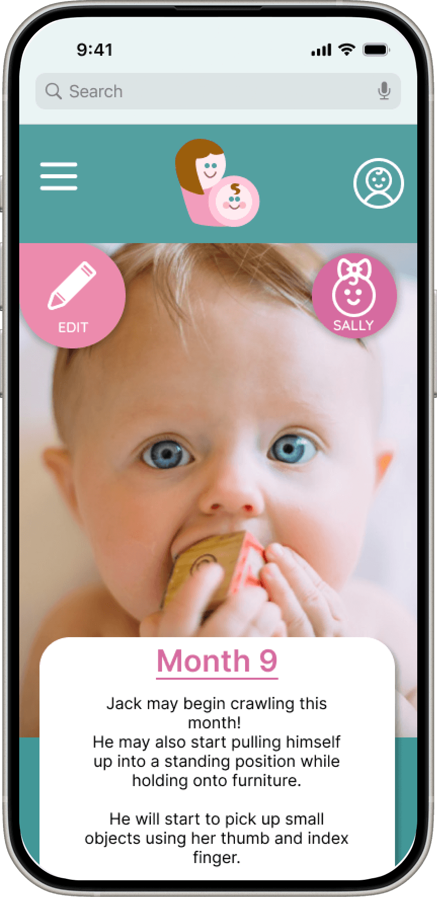
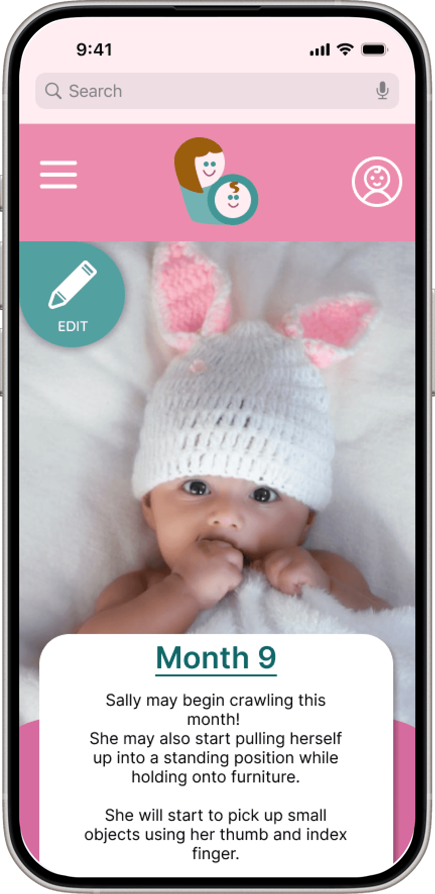
Growth charts to clearly show physical development over time
Milestone descriptions to explain what is typically expected at each stage of development
Baby profile with photo to personalize the experience and help parents feel more connected to the app
Growth charts to clearly show physical development over time
Health and habit analysis to help parents see patterns and better understand their baby’s progress
Milestone descriptions to explain what is typically expected at each stage of development
Baby profile with photo to personalize the experience and help parents feel more connected to the app
What We Stand For, Tiny Edition
Family Focused
The purpose of My Lil Boo is to support couples as they build their family.
The logo reflects a family focused value by showing a mother with her baby, symbolizing love, care, and connection.

Education, focus on Health
An important feature of this website is to help new parents with health-related questions and concerns. It provides guides and articles, messages when parents should call the doctor, a way to track baby's vital signs, and a way to find a pediatrician nearby.
Reliability
Trust is very important, especially when it comes to health-related information about babies.
How a font looks can elicit a sense of trust from the users. Quicksand was chosen because it is simple and legible. It is also similar to fonts used in other baby tracking apps, which helps the site feel more familiar and trustworthy to users.

Inviting and Friendly
My Lil Boo was designed to feel friendly and welcoming. This is shown through the playful font and soft, inviting colors.
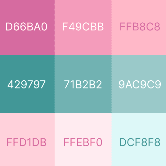
Two color versions were created:
A pink primary color for the girl version
A blue-green primary color for the boy version
Each version uses the other color as a secondary color, and both use white text fields for clarity and consistency. This keeps the design consistent across both versions while still allowing for personalization and strong brand recognition.
Three Parent Flows
Three Main Flows
Sign Up Flow where users sign up for My Lil Boo and end at the homepage
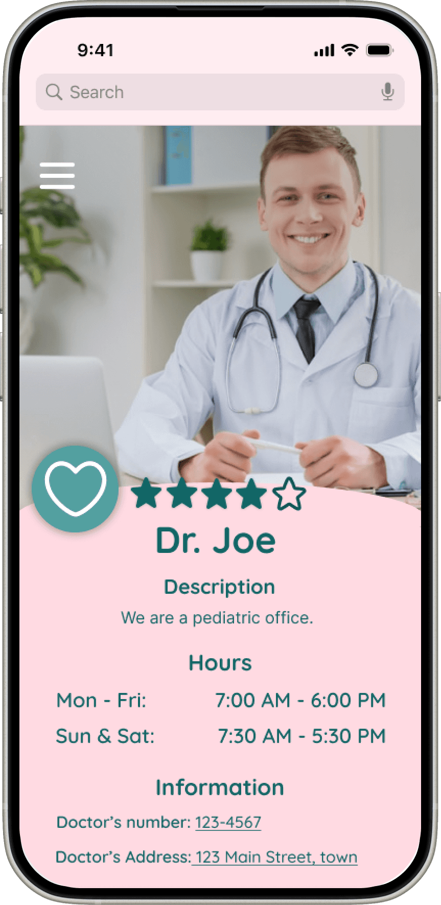
Pediatrician Finder, where users would find and save a doctor
Fever Flow users would use the temperature tracker
Fever Flow users would use the temperature tracker
Three Parent Flows
Three Main Flows
Sign Up Flow where users sign up for My Lil Boo and end at the homepage
Pediatrician Finder, where users would find and save a doctor
Fever Flow users would use the temperature tracker
Design
Layouts Crafted for New Parents
Next Steps
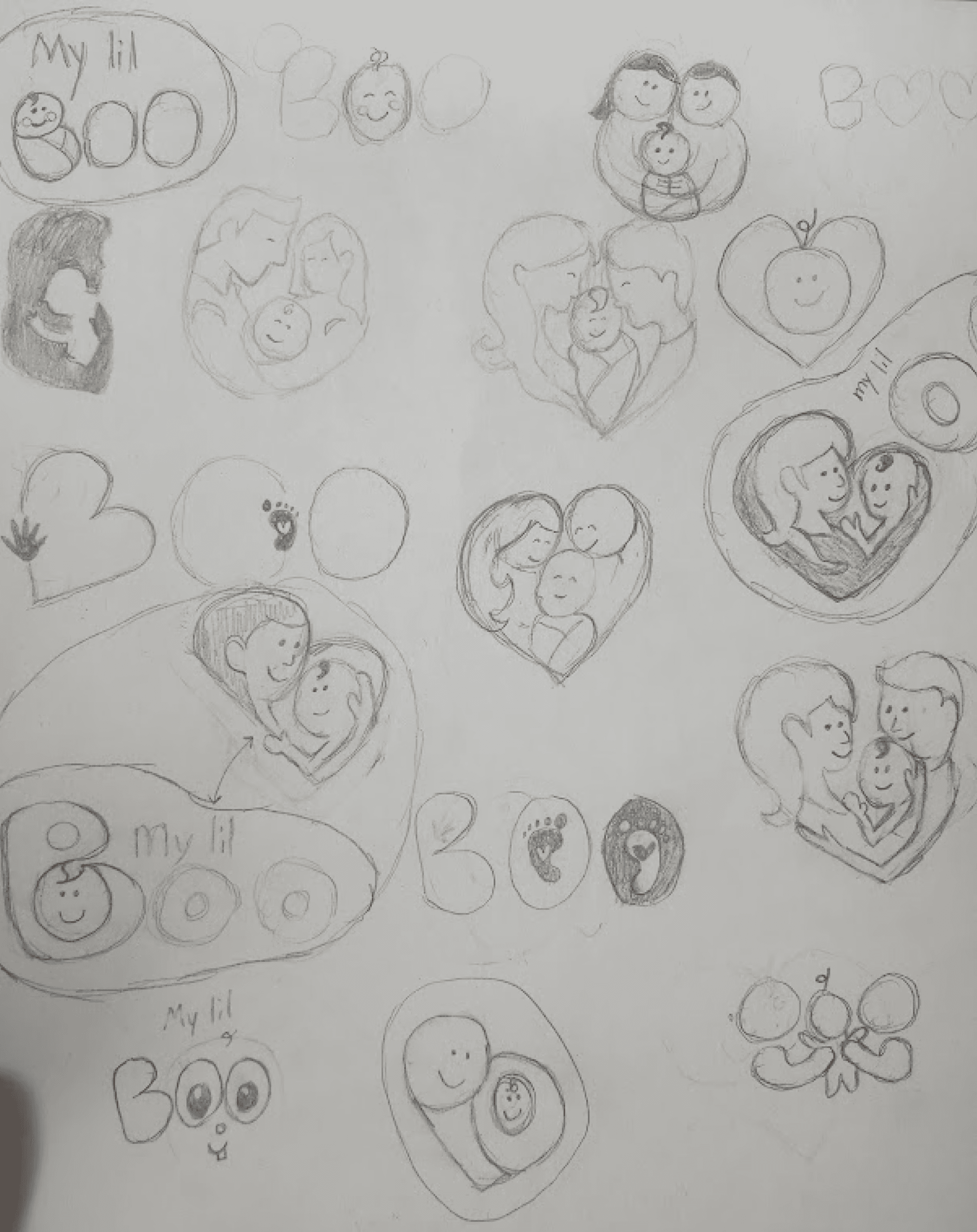
I sketched layouts for each screen
I created user flows: Sign up, Pediatrician finder, and the Fever flow
I moved sketches to Figma, and prototyped into testable flows
I conducted user testing
I iterated through low-, mid-, and high-fidelity designs, refining the experience at each stage
Testing
Three Big Changes For Happier Parents
I conducted unmoderated testing,
Users could explore whole website
The sign up flow
Pediatrician Finder
Fever tracking
The study included five parents - four mothers and one father
Feedback was highly positive
100% task completion
Each task completed under 2 minutes
Parents stated that they would use My Lil Boo
The most significant design changes, along with the rationale behind them, are outlined below.
The study included five parents - four mothers and one father
Parents stated that they would use My Lil Boo
Feedback was highly positive
100% task completion
Each task completed under 2 minutes
The most significant design changes, along with the rationale behind them, are outlined below.
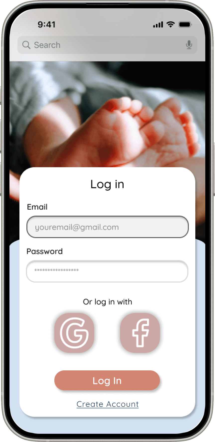
Reducing Misclicks in Sign Up Flow
To reduce misclicks and improve clarity, I shortened the height of the sign-up and log-in screens, minimizing unnecessary scrolling and making the next action more obvious. This helped users move through the flow with greater confidence and fewer errors.
I also added the ability to add more than one baby during sign-up, better reflecting real user needs and reducing friction later in the experience.
Testing
Hamburger Menu
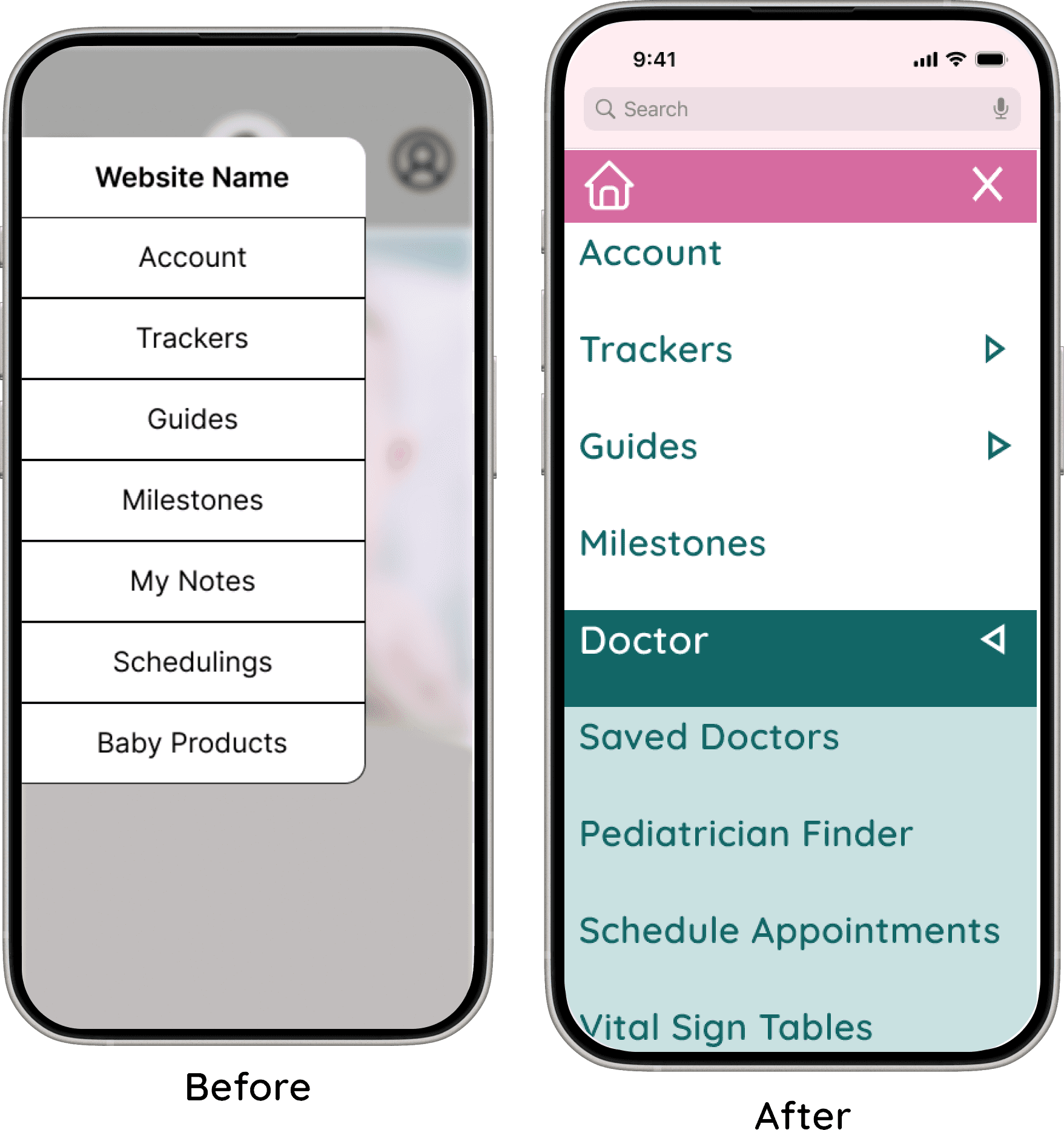
The second change focused on improving accessibility and usability within the hamburger menu. I increased the size of the menu icon and its buttons to make interactions easier and more accurate. This adjustment also reduced visual crowding, resulting in a cleaner and more approachable menu layout.
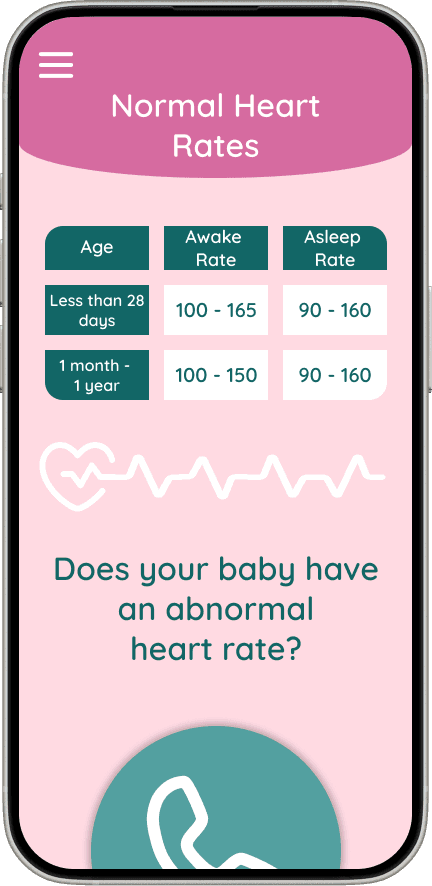
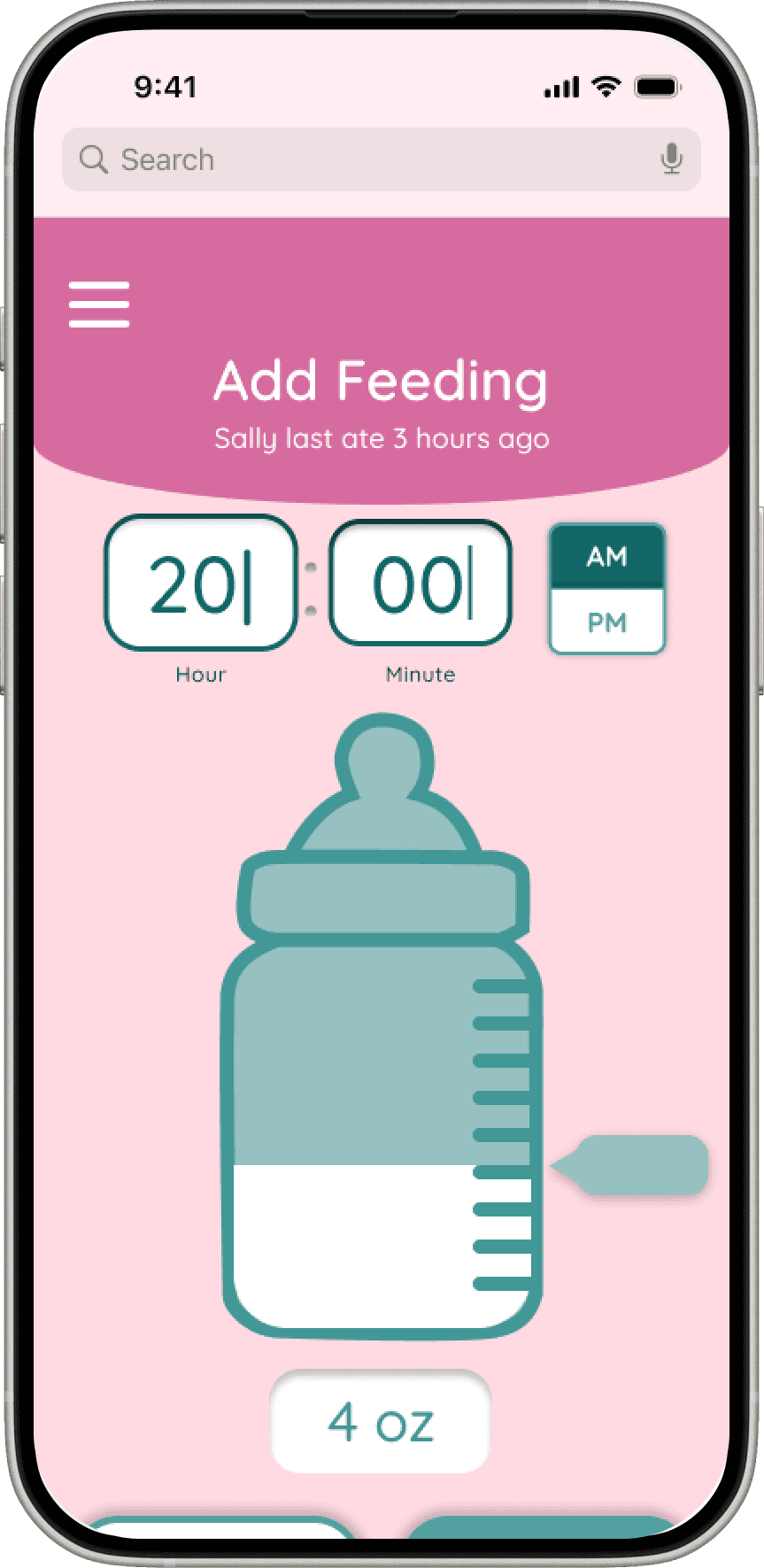
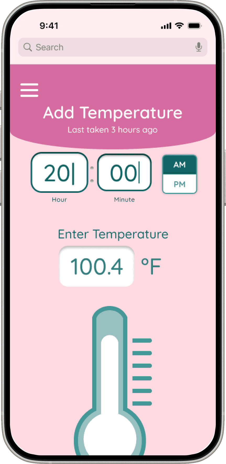
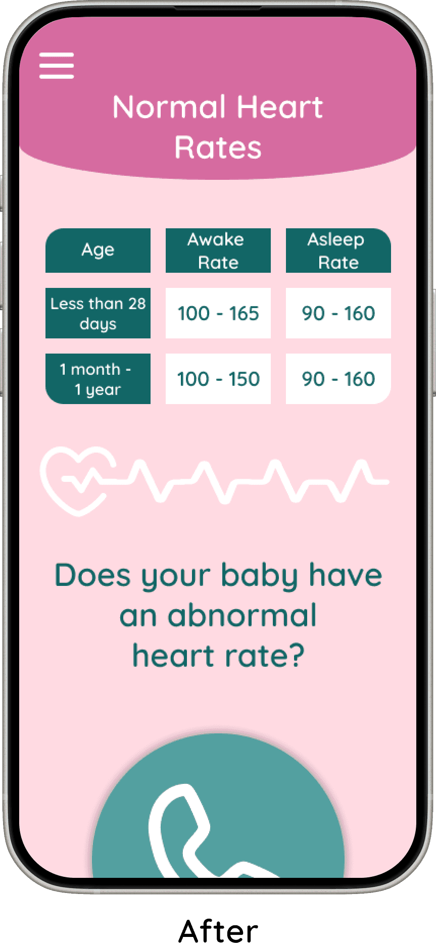
Baby's Vital Signs
I added dedicated screens for tracking a baby’s vital signs to reinforce the app’s focus on health and well-being. This ensured that health monitoring was a clear, central part of the experience rather than a secondary feature.
Final Product
Design Delight
“Everything looked great! I love this idea!”
“Looks nice.”
“I thought the website was really cute.”
Intuitive & Friendly
“The website was set up to be very user-friendly.”
“I think the layout was cute and easy to read and understand.”
Health-First Focus
Parents valued the emphasis on tracking habits and health information, especially the inclusion of actionable insights and guidance on when to contact a doctor.
Trusted Resource
Users felt confident using the site and expressed interest in recommending it to friends, reinforcing its usefulness and reliability.
Design Delight
Users loved the cute colors, playful icons, and customizable baby profiles—making the site feel approachable and fun.
Intuitive & Friendly
The layout was praised for being clear and easy to navigate, creating a smooth, stress-free experience.
Health First
Parents valued the focus on tracking habits and health information, with actionable insights and guidance on when to contact a doctor.
Trusted Resource
Users felt confident using the site and even wanted to recommend it to friends, highlighting its usefulness and reliability.
Conclusion
Like Parenting, Challenging but Rewarding
My first project came with many challenges, from small inconveniences to moments where I struggled to understand how certain elements were supposed to work. Despite this, the experience was incredibly rewarding, as it pushed me to grow as both a researcher and designer. Overcoming these obstacles made the final outcome feel even more meaningful.
I entered the project with preconceived notions of where it would lead, but early research—especially user interviews—helped me pivot. For instance, I realized the focus needed to shift more toward health than I had originally planned. Each step, even those that seemed unclear at first, ultimately provided insight and added depth to the project.
What made this project especially fulfilling was that it spoke to me personally. As a mother, I was motivated by the opportunity to help new parents care for their babies. This personal connection allowed me to pour effort, thought, and heart into the project, resulting in a product that feels purposeful and impactful.
Like Parenting, Challenging but Rewarding
Conclusion
Design
Layouts Crafted for New Parents
Next Steps
I sketched layouts for each screen
I created user flows: Sign up, Pediatrician finder, and the Fever flow
I moved sketches to Figma, and prototyped into testable flows
I conducted user testing
I iterated through low-, mid-, and high-fidelity designs, refining the experience at each stage
Testing
Reducing Misclicks in Sign Up Flow
To reduce misclicks and improve clarity, I shortened the height of the sign-up and log-in screens, minimizing unnecessary scrolling and making the next action more obvious. This helped users move through the flow with greater confidence and fewer errors.
I also added the ability to add more than one baby during sign-up, better reflecting real user needs and reducing friction later in the experience.
Baby's Vital Signs
I added dedicated screens for tracking a baby’s vital signs to reinforce the app’s focus on health and well-being. This ensured that health monitoring was a clear, central part of the experience rather than a secondary feature.

Hamburger Menu
The second change focused on improving accessibility and usability within the hamburger menu. I increased the size of the menu icon and its buttons to make interactions easier and more accurate. This adjustment also reduced visual crowding, resulting in a cleaner and more approachable menu layout.
Three Big Changes For Happier Parents
I conducted unmoderated testing,
Users could explore whole website
The sign up flow
Pediatrician Finder
Fever tracking
The study included five parents - four mothers and one father
Parents stated that they would use My Lil Boo
Feedback was highly positive
100% task completion
Each task completed under 2 minutes
The most significant design changes, along with the rationale behind them, are outlined below.
Final Product
Design Delight
“Everything looked great! I love this idea!”
“Looks nice.”
“I thought the website was really cute.”
Intuitive & Friendly
“The website was set up to be very user-friendly.”
“I think the layout was cute and easy to read and understand.”
Health-First Focus
Parents valued the emphasis on tracking habits and health information, especially the inclusion of actionable insights and guidance on when to contact a doctor.
Trusted Resource
Users felt confident using the site and expressed interest in recommending it to friends, reinforcing its usefulness and reliability.
Conclusion
My first project came with many challenges, from small inconveniences to moments where I struggled to understand how certain elements were supposed to work. Despite this, the experience was incredibly rewarding, as it pushed me to grow as both a researcher and designer. Overcoming these obstacles made the final outcome feel even more meaningful.
I entered the project with preconceived notions of where it would lead, but early research—especially user interviews—helped me pivot. For instance, I realized the focus needed to shift more toward health than I had originally planned. Each step, even those that seemed unclear at first, ultimately provided insight and added depth to the project.
What made this project especially fulfilling was that it spoke to me personally. As a mother, I was motivated by the opportunity to help new parents care for their babies. This personal connection allowed me to pour effort, thought, and heart into the project, resulting in a product that feels purposeful and impactful.
Like Parenting, Challenging but Rewarding
Define
Healthy Babies, Happy Parents
Prioritized Features chosen to support and help new parents
Guides and articles to give parents quick access to reliable health and development information
Customizable health and habit trackers so parents can track routines that matter most to them, such as feeding and sleep
Growth charts to clearly show physical development over time
Health and habit analysis to help parents see patterns and better understand their baby’s progress
Milestone descriptions to explain what is typically expected at each stage of development
Baby profile with photo to personalize the experience and help parents feel more connected to the app
Education, focus on Health
An important feature of this website is to help new parents with health-related questions and concerns. It provides guides and articles, messages when parents should call the doctor, a way to track baby's vital signs, and a way to find a pediatrician nearby.
Family Focused
The purpose of My Lil Boo is to support couples as they build their family.
The logo reflects a family focused value by showing a mother with her baby, symbolizing love, care, and connection.

What We Stand For, Tiny Edition
Reliability
Trust is very important, especially when it comes to health-related information about babies.
How a font looks can elicit a sense of trust from the users. Quicksand was chosen because it is simple and legible. It is also similar to fonts used in other baby tracking apps, which helps the site feel more familiar and trustworthy to users.
Inviting and Friendly
My Lil Boo was designed to feel friendly and welcoming. This is shown through the playful font and soft, inviting colors.
Two color versions were created:
A pink primary color for the girl version
A blue-green primary color for the boy version
Each version uses the other color as a secondary color, and both use white text fields for clarity and consistency. This keeps the design consistent across both versions while still allowing for personalization and strong brand recognition.
Three Parent Flows
Three Main Flows
Sign Up Flow where users sign up for My Lil Boo and end at the homepage
Pediatrician Finder, where users would find and save a doctor
Fever Flow users would use the temperature tracker