
Intro
A New Website for a Village With Old Charm
I was tasked with redesigning the website for the Village of Gainesville
I was especially excited to take on this project, as it’s for the town where I grew up. Having a personal connection to the community made working on this website feel more meaningful.
I worked directly with a member of the village board who oversaw the website. While the original site—built on Wix—contained all the necessary information, it struggled visually and lacked cohesion.
This project focused entirely on UI design.
The site suffered from several design issues, including inconsistent layouts, misaligned elements, and a lack of visual hierarchy and polish.
Before
My Role as a UI Designer
Competitive Analysis - End-to end design
Research
Making website useable - Connecting domain - Making website accessible to public
Usability & Accessibility
Designing layout - Branding - Final UI - Final project deliverables
End-to-End Design
Solo project for client, 4 week timeline, used Figma and Framer
Project Overview
Design
Harvesting Fresh Design Ideas
I found inspiration for fonts, color schemes, hero layouts, footer layouts, as well as any idea to use maps for certain locations.
Building a Layout the Whole Village Can Navigate
Organizing information into clear sections
I began by sketching ideas for layouts, inspired by the mood board. Once I discovered a few potential layouts I moved into Figma to refine the design.
My primary focus when it came to the layout was to reorganize content and information into clearly defined sections. To reinforce structure and hierarchy, I introduced banner-style headings for each section.
For the footer, I added a message form that allows Gainesville residents to contact the village clerk directly with any questions or concerns.
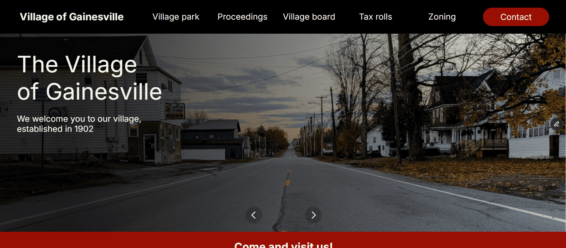
I redesigned the website so each page features a unique, relevant hero image for a part of the village (e.g., the Proceedings page shows location where proceedings take place), with additional village imagery used throughout.
The homepage's hero is a slideshow highlighting different areas of the village.
I embedded Google Maps wherever addresses appear to improve navigation.
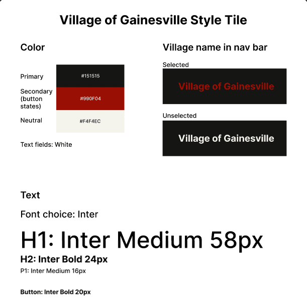
To keep the focus on visuals, I replaced the decorative font with Inter, a clean and modern typeface that enhances readability.
Bringing the Village Into Focus
Highlighting the village with the use of images of the village itself
Bringing the Village Into Focus
Highlighting the village with the use of images of the village itself


A Color System Rooted in Village Identity
Red and black are the colors of the Gainesville School, which serves as a central hub for the community.
The school connects residents across generations through education, events, sports, and shared experiences. Red also appears throughout the village in prominent locations, such as the park pavilion and the fire hall.
To avoid overwhelming users or creating an overly aggressive tone, I used red sparingly as an accent color. I paired it with dark gray as a softer alternative to black and used an off-white background to keep the overall design light, balanced, and approachable.
A Color System Rooted in Village Identity
Red and black are the colors of the Gainesville School, which serves as a central hub for the community.
One Easy Village Website Fix
The client requested that I reorganize the Proceedings page
Originally the Proceedings pages was split into three main sections: Meetings and Hearings, Budget Info, and Voting Info.
My client requested that two main sections: Meetings and Voting Info. Then to add subsections under the Meetings section. The subsections would be Meeting Minutes, Updates, and Budget Hearings.
Before
After
Building a Layout the Whole Village Can Navigate
Organizing information into clear sections
I began by sketching ideas for layouts, inspired by the mood board. Once I discovered a few potential layouts I moved into Figma to refine the design.
My primary focus when it came to the layout was to reorganize content and information into clearly defined sections. To reinforce structure and hierarchy, I introduced banner-style headings for each section.
For the footer, I added a message form that allows Gainesville residents to contact the village clerk directly with any questions or concerns.
Building a Layout the Whole Village Can Navigate
I began by sketching ideas for layouts, inspired by the mood board. Once I discovered a few potential layouts I moved into Figma to refine the design.
My primary focus when it came to the layout was to reorganize content and information into clearly defined sections. To reinforce structure and hierarchy, I introduced banner-style headings for each section.
For the footer, I added a message form that allows Gainesville residents to contact the village clerk directly with any questions or concerns.
Organizing information into clear sections
Design
A Color System Rooted in Village Identity
The school connects residents across generations through education, events, sports, and shared experiences. Red also appears throughout the village in prominent locations, such as the park pavilion and the fire hall.
To avoid overwhelming users or creating an overly aggressive tone, I used red sparingly as an accent color. I paired it with dark gray as a softer alternative to black and used an off-white background to keep the overall design light, balanced, and approachable.
Red and black are the colors of the Gainesville School, which serves as a central hub for the community.
Before
After
Final Product
Welcoming the Village to Their New Online Home
A "spiffy" new village website
By the time I finished it was a completely different website, with a fresh layout and a new brand.
My client was extremely excited with the final project. She loved how it was organized, the use of the village pictures, and the colors I chose. She stated that "it looks very professional."
A professional designer with years of experience looked over my project before I made the new site live. She said “I really see your devotion when it's something that matters to you.”
The rest of the Village Board loved how professional the new website looked, the village mayor saying that it looked "spiffy".
Welcoming the Village of to Their New Online Home
A "spiffy" new village website
Conclusion
Inspired by the Streets and Faces I Know
This was my first client project, working with a member of a small village board—specifically, the village where I grew up. Seeing my work live in the real world and impacting a community I care about was incredibly rewarding. It was important to me that this project served a meaningful purpose and genuinely benefited the people who use the site.
Redesigning a website so closely tied to home sparked a desire to reach out to other small villages and local businesses that could benefit from thoughtful, modern design. Many of these organizations rely on their websites as primary points of communication, yet lack the resources to keep them up to date.
The project was also refreshing in its focus on visual design, which is my favorite part of the web design process. Working on a purely design-driven website reinforced my interest in taking on similar projects for local communities in the future.
Inspired by the Streets and Faces I Know
Conclusion
Welcoming the Village to Their New Online Home
By the time I finished it was a completely different website, with a fresh layout and a new brand.
My client was extremely excited with the final project. She loved how it was organized, the use of the village pictures, and the colors I chose. She stated that "it looks very professional."
A professional designer with years of experience looked over my project before I made the new site live. She said “I really see your devotion when it's something that matters to you.”
The rest of the Village Board loved how professional the new website looked, the village mayor saying that it looked "spiffy".
A "spiffy" new village website
Final Product
This was my first client project, working with a member of a small village board—specifically, the village where I grew up. Seeing my work live in the real world and impacting a community I care about was incredibly rewarding. It was important to me that this project served a meaningful purpose and genuinely benefited the people who use the site.
Redesigning a website so closely tied to home sparked a desire to reach out to other small villages and local businesses that could benefit from thoughtful, modern design. Many of these organizations rely on their websites as primary points of communication, yet lack the resources to keep them up to date.
The project was also refreshing in its focus on visual design, which is my favorite part of the web design process. Working on a purely design-driven website reinforced my interest in taking on similar projects for local communities in the future.
Inspired by the Streets and Faces I Know
Conclusion
Intro
A New Website for a Village With Old Charm
I was especially excited to take on this project, as it’s for the town where I grew up. Having a personal connection to the community made working on this website feel more meaningful.
I worked directly with a member of the village board who oversaw the website. While the original site—built on Wix—contained all the necessary information, it struggled visually and lacked cohesion.
This project focused entirely on UI design.
The site suffered from several design issues, including inconsistent layouts, misaligned elements, and a lack of visual hierarchy and polish.
I was tasked with redesigning the website for the Village of Gainesville
Before
My Role as a UI Designer
Competitive Analysis - End-to end design
Research
Making website useable - Connecting domain - Making website accessible to public
Usability & Accessibility
Designing layout - Branding - Final UI - Final project deliverables
End-to-End Design
Solo project for client, 4 week timeline, used Figma and Framer
Project Overview