Intro
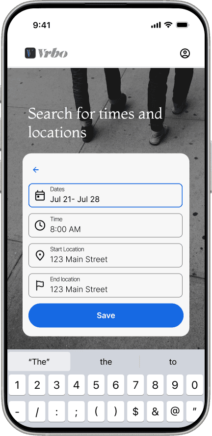
Scheduling a Trip on VRBO
Scheduling a Trip on VRBO
Improving the Travel Experience
My family and I love to travel, and VRBO is our go-to for finding rentals. But booking a place to stay is only one piece of the trip—planning what to do once you arrive takes just as much time, and often requires switching between multiple apps and scattered notes.
VRBO users currently rely on other tools to find activities, events, and local experiences. This raised a simple question: what if they didn’t have to?
For this project, I designed a Schedule feature for VRBO. In addition to booking rentals, travelers can search for nearby activities and events based on where they’re staying, then save everything—reservations, plans, and experiences—into one cohesive itinerary.

My Role as a UX Designer
Competitive Analysis - Usability scripts - User interviews - User testing - Analyzing feedback - Prioritizing features
Research
Sketches - Wireframing - Prototyping - Mid-fidelity - Hi-Fidelity - Final product
End-to-End Design
Project through UX/UI Academy, 5 week timeline
Project Overview
Sketchbook - Zoom - Maze - Figma - Group critiques - Mentor Feedback
Tools and Resources
Scheduling a Trip on VRBO
Improving the Travel Experience
My family and I love to travel, and VRBO is our go-to for finding rentals. But booking a place to stay is only one piece of the trip—planning what to do once you arrive takes just as much time, and often requires switching between multiple apps and scattered notes.
VRBO users currently rely on other tools to find activities, events, and local experiences. This raised a simple question: what if they didn’t have to?
For this project, I designed a Schedule feature for VRBO. In addition to booking rentals, travelers can search for nearby activities and events based on where they’re staying, then save everything—reservations, plans, and experiences—into one cohesive itinerary.
Intro
My Role as a UX Designer
Competitive Analysis - Usability scripts - User interviews - User testing - Analyzing feedback - Prioritizing features
Research
Sketches - Wireframing - Prototyping - Mid-fidelity - Hi-Fidelity - Final product
End-to-End Design
Project through UX/UI Academy, 5 week timeline
Project Overview
Sketchbook - Zoom - Maze - Figma - Group critiques - Mentor Feedback
Tools and Resources

Research
Research
Scouting the Competition

Strengths
Gave suggestions based off of where they had previously stayed
Could put rental and activities into schedule
Search for events and activities
Gave suggestions based off of where they had previously stayed
Could put rental and activities into schedule
Search for events and activities
Weaknesses
VRBO can't create a schedule
VRBO can't search for events and activities
Competition didn't have any obvious weaknesses
VRBO can't create a schedule
VRBO can't search for events and activities
Competition didn't have any obvious weaknesses
Passport to User Insights
To inform my design decisions, I spoke directly with five users of VRBO or similar online tools to better understand their travel habits and pain points. Participants traveled anywhere from once to four times per year and included parents of young children, older couples, and groups traveling with friends.
Findings
Travelers struggled to keep all trip-related information—such as events, activities, and plans—organized in one place
Transportation planning between locations was another recurring challenge, as was deciding what to do once they arrived at their destination.
While the specific problems varied, a clear pattern emerged: a centralized scheduling feature could address all of these core needs. This insight led me to focus on the schedule as a key solution for organizing information, reducing friction, and improving the overall travel experience.


Passport to User Insights
To inform my design decisions, I spoke directly with five users of VRBO or similar online tools to better understand their travel habits and pain points. Participants traveled anywhere from once to four times per year and included parents of young children, older couples, and groups traveling with friends.
Findings
Travelers struggled to keep all trip-related information—such as events, activities, and plans—organized in one place
Transportation planning between locations was another recurring challenge, as was deciding what to do once they arrived at their destination.
While the specific problems varied, a clear pattern emerged: a centralized scheduling feature could address all of these core needs. This insight led me to focus on the schedule as a key solution for organizing information, reducing friction, and improving the overall travel experience.
Define
For Every Planner and Every Pathfinder
Prioritization for Schedule Feature Flow
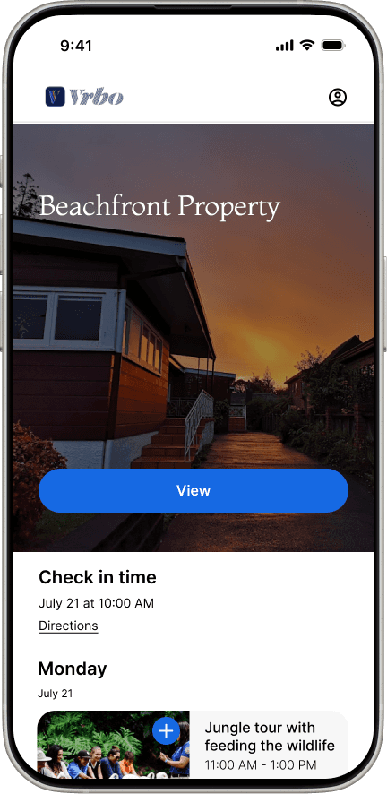
Add rental to schedule
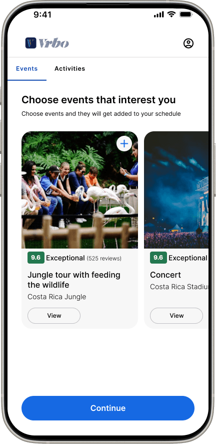
Activity and events suggestions based off location
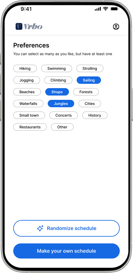
Ability to choose preferences for activities and events
Ability to add extra activities; like nap or walk around town, and customize times and days
Option for AI randomize schedule based off of preferences
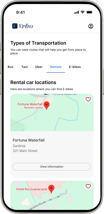
Find and add transportation
Ability to choose preferences for activities and events
Option for AI randomize schedule based off of preferences
Find and add transportation
Design
Prototyping the Perfect Getaways
Next Steps
Sketching layouts, keeping to VRBO's style
Screens and flows in Figma
Unmoderated testing of the flows
High Fidelity, using the feedback
Testing
Smoothing the Road to Booking
I conducted moderated testing over Zoom video calls with the same users.
Finding and renting a rental
Choosing preferences for activities and events
View and add to the draft of the schedule
Finding and adding transportation
Viewing the final schedule
The study included five travelers with experience using travel tools
Highly positive feedback
100% completion rate
Tasks completed under 1 minute
The most significant design changes, along with the rationale behind them, are outlined below.
Clearer Action Buttons on Activities and Events
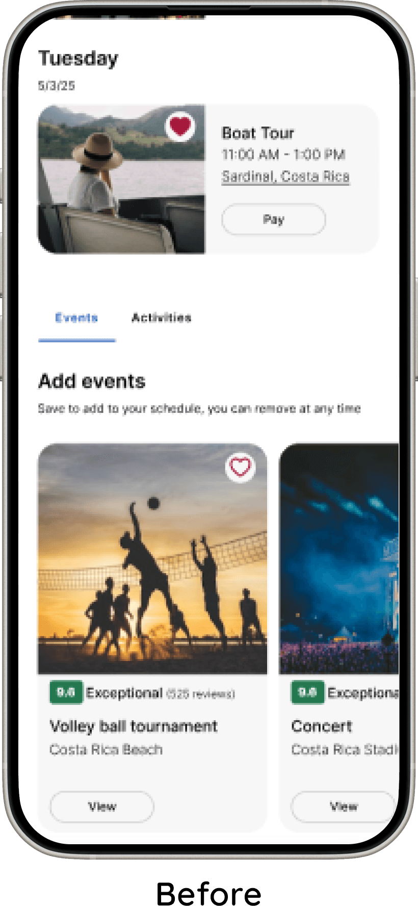
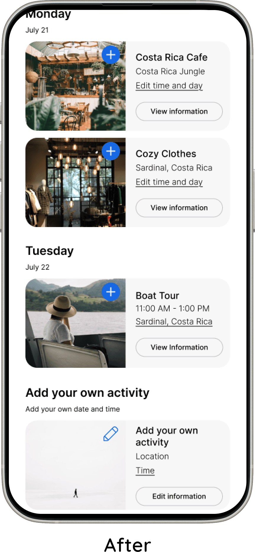
Users were confused by inconsistent button labels on activity and event cards, so I standardized both to “View Information.” For events, the option to pay was moved to the information screen, reducing confusion at the card level.
I also replaced the heart icon with an add icon, as users felt it better communicated the action of adding an item to their schedule.
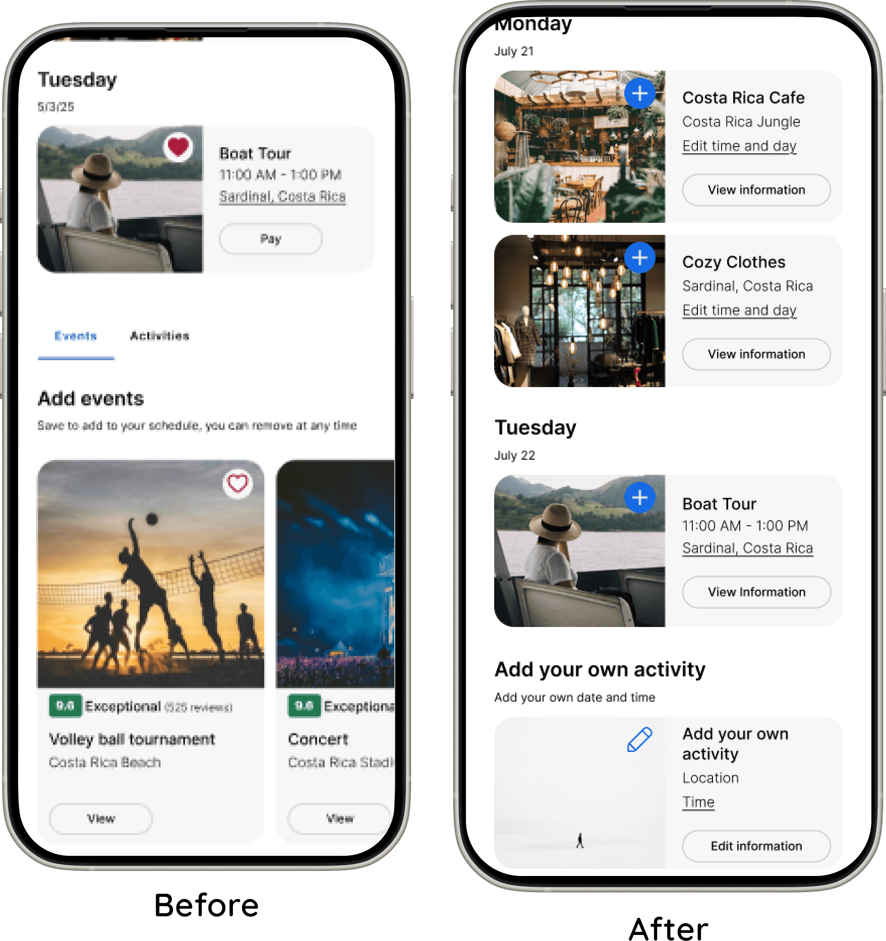
“Add Your Own Activity” Card
The “Add Your Own Activity” card was redesigned to be more discoverable. Previously, it blended in with other activities and was difficult for users to find.
To resolve this, I gave it a distinct visual style and placed it in its own section with a short description, making its purpose clear and easy to locate.
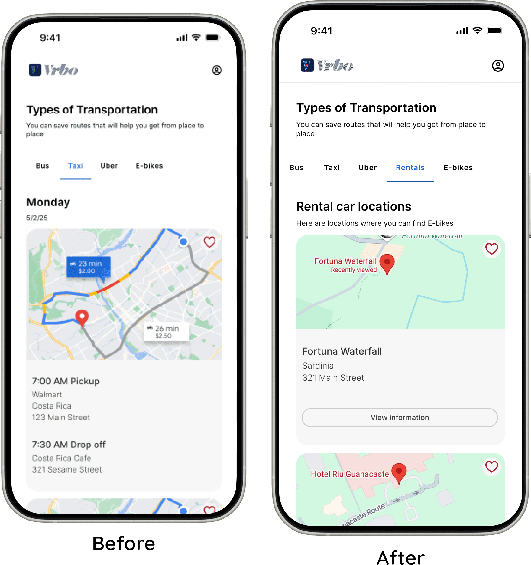
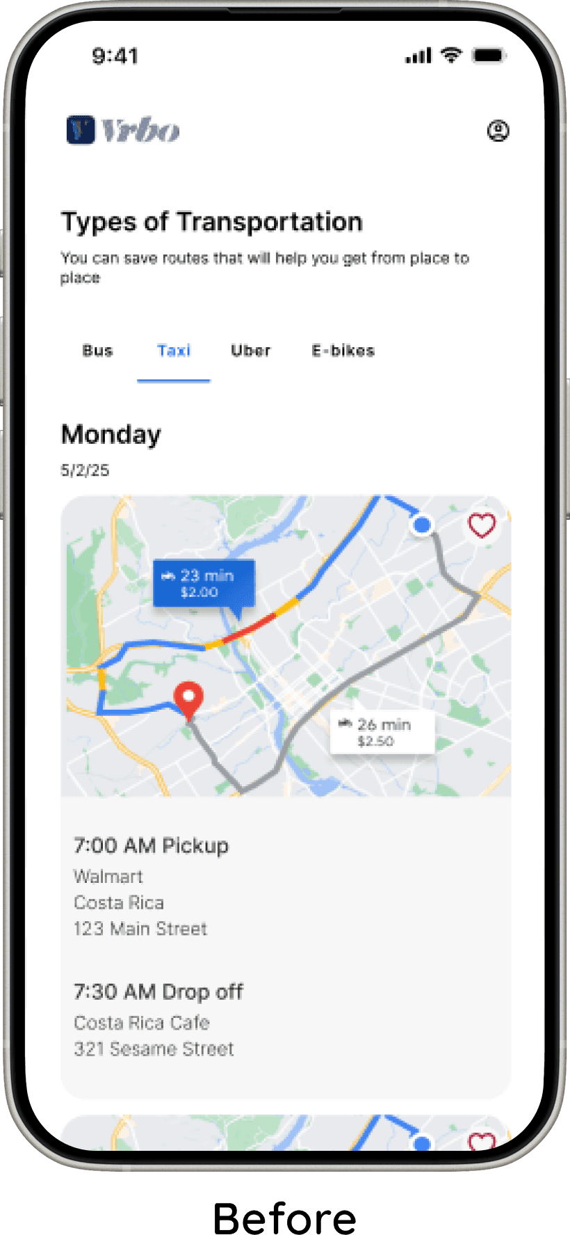
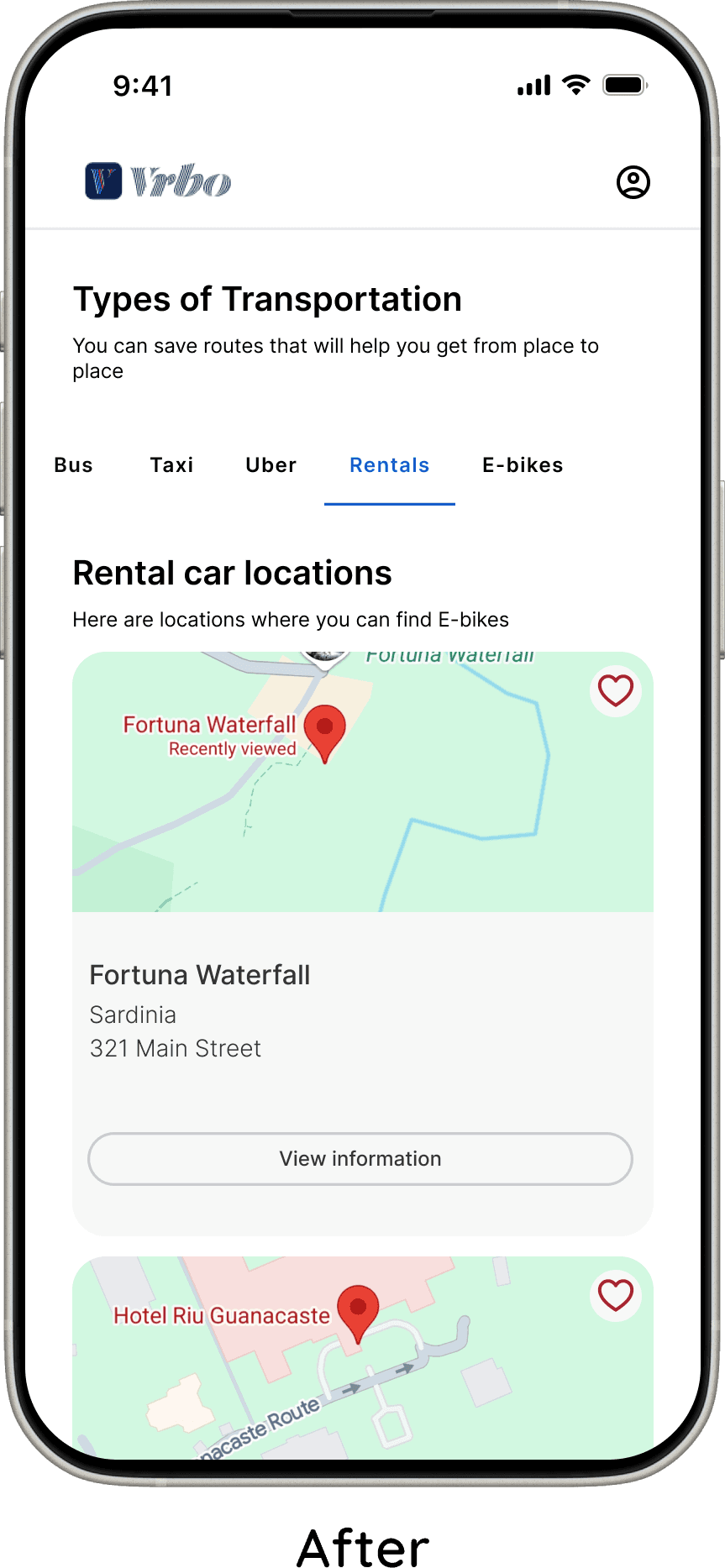
Finding Rental Cars
Users wanted to be able to view information on rental cars when figuring out transportation for trip. I added this option.
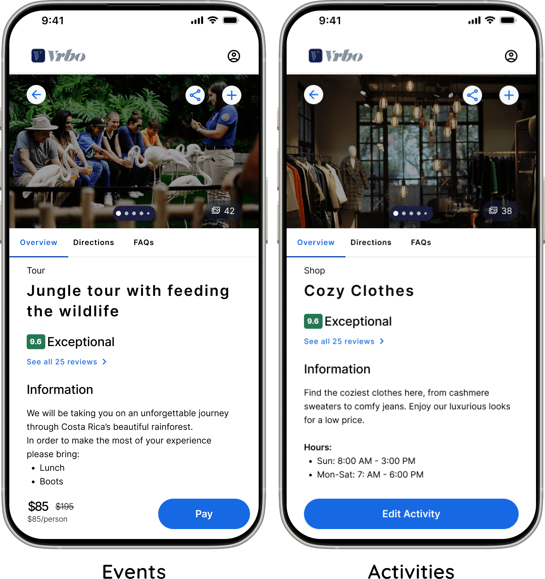
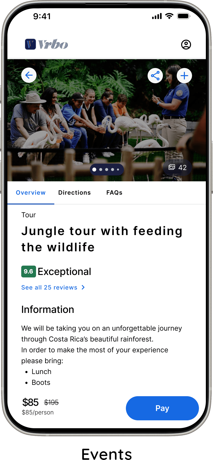
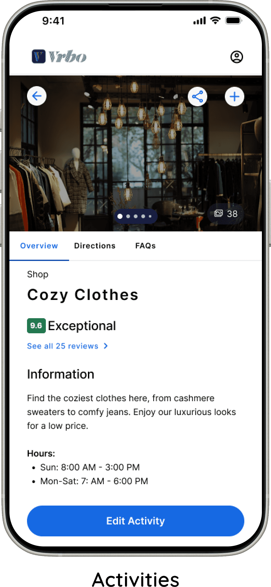
View Activity And Event Info
Users wanted clearer details for events and activities, including location, cost, duration, and what to bring.
To address this, I added a dedicated information screen that consolidated these details in one place.
Clearer Action Buttons on Activities and Events
Users were confused by inconsistent button labels on activity and event cards, so I standardized both to “View Information.” For events, the option to pay was moved to the information screen, reducing confusion at the card level.
I also replaced the heart icon with an add icon, as users felt it better communicated the action of adding an item to their schedule.
“Add Your Own Activity” Card
The “Add Your Own Activity” card was redesigned to be more discoverable. Previously, it blended in with other activities and was difficult for users to find. To resolve this, I gave it a distinct visual style and placed it in its own section with a short description, making its purpose clear and easy to locate.
Finding Rental Cars
Users wanted to be able to view information on rental cars when figuring out transportation for trip, so I added this option.
View Activity And Event Info
Users stated that they would like to be able to view information about the different events activities, to see where it is, how much it costs, how long it takes, and what they need to bring. I added a screen that provided this information.
Testing
Smoothing the Road to Booking
I conducted moderated testing over Zoom video calls with the same users.
Finding and renting a rental
Choosing preferences for activities and events
View and add to the draft of the schedule
Finding and adding transportation
Viewing the final schedule
The study included five travelers with experience using travel tools
Highly positive feedback
100% completion rate
Tasks completed under 1 minute
The most significant design changes, along with the rationale behind them, are outlined below.
Final Product
Scheduling that Simplifies Every Stay
Flexible Schedule Saving
Users loved being able to export their final schedule to Google Calendar for reminders and easy access. Those who prefer physical copies also appreciated the option to print their schedule, making the feature flexible for different planning styles.
Seamless Fit with the VRBO Brand
Users felt the Schedule feature fit VRBO’s brand and visual style so naturally that it felt like an existing part of the product. Several noted they wished VRBO already offered this feature.
All Plans in One Place
Travelers found the ability to discover and save nearby activities and events into a single schedule extremely helpful. Centralizing trip details solved the frustration of having information spread across multiple apps, and users said they would regularly use the feature.
Transportation Made Simple
Transportation planning stood out as a major win. Since navigating between locations was a common pain point, users appreciated having transportation integrated directly into the schedule. One user remarked, “It feels familiar, because it’s similar to Google Maps,” reinforcing trust and ease of use.
Conclusion
Rerouting My Assumptions
I enjoyed this project more than I expected. Initially, I assumed that adding a feature to an existing product wouldn’t be as engaging or creatively challenging as designing something entirely new. That assumption quickly proved incorrect. Improving a mature product required a different kind of creativity—one focused on identifying gaps, respecting existing patterns, and designing thoughtful enhancements within real constraints.
I also assumed that meaningfully improving a product as established as VRBO—used by millions and refined through countless iterations—would be unrealistic for a solo designer. However, once I narrowed my focus to travel tools and began speaking directly with users, the problem space became much clearer. User interviews revealed tangible opportunities for improvement and made the challenge feel both approachable and rewarding.
Rerouting My Assumptions
Conclusion
Design
Prototyping the Perfect Getaways
Next Steps
Sketching layouts, keeping to VRBO's style
Screens and flows in Figma
Unmoderated testing of the flows
High Fidelity, using the feedback
Testing
Clearer Action Buttons on Activities and Events
Users were confused by inconsistent button labels on activity and event cards, so I standardized both to “View Information.” For events, the option to pay was moved to the information screen, reducing confusion at the card level.
I also replaced the heart icon with an add icon, as users felt it better communicated the action of adding an item to their schedule.
“Add Your Own Activity” Card
The “Add Your Own Activity” card was redesigned to be more discoverable. Previously, it blended in with other activities and was difficult for users to find. To resolve this, I gave it a distinct visual style and placed it in its own section with a short description, making its purpose clear and easy to locate.
View Activity And Event Info
Users stated that they would like to be able to view information about the different events activities, to see where it is, how much it costs, how long it takes, and what they need to bring. I added a screen that provided this information.
Finding Rental Cars
Users wanted to be able to view information on rental cars when figuring out transportation for trip. I added this option.
Smoothing the Road to Booking
I conducted moderated testing over Zoom video calls with the same users.
Finding and renting a rental
Choosing preferences for activities and events
View and add to the draft of the schedule
Finding and adding transportation
Viewing the final schedule
The study included five travelers with experience using travel tools
Highly positive feedback
100% completion rate
Tasks completed under 1 minute
The most significant design changes, along with the rationale behind them, are outlined below.
Scheduling that Simplifies Every Stay
Final Product
Seamless Fit with the VRBO Brand
Users felt the Schedule feature fit VRBO’s brand and visual style so naturally that it felt like an existing part of the product. Several noted they wished VRBO already offered this feature.
All Plans in One Place
Travelers found the ability to discover and save nearby activities and events into a single schedule extremely helpful. Centralizing trip details solved the frustration of having information spread across multiple apps, and users said they would regularly use the feature.
Transportation Made Simple
Transportation planning stood out as a major win. Since navigating between locations was a common pain point, users appreciated having transportation integrated directly into the schedule. One user remarked, “It feels familiar, because it’s similar to Google Maps,” reinforcing trust and ease of use.
Flexible Schedule Saving
Users loved being able to export their final schedule to Google Calendar for reminders and easy access. Those who prefer physical copies also appreciated the option to print their schedule, making the feature flexible for different planning styles.
Conclusion
I enjoyed this project more than I expected. Initially, I assumed that adding a feature to an existing product wouldn’t be as engaging or creatively challenging as designing something entirely new. That assumption quickly proved incorrect. Improving a mature product required a different kind of creativity—one focused on identifying gaps, respecting existing patterns, and designing thoughtful enhancements within real constraints.
I also assumed that meaningfully improving a product as established as VRBO—used by millions and refined through countless iterations—would be unrealistic for a solo designer. However, once I narrowed my focus to travel tools and began speaking directly with users, the problem space became much clearer. User interviews revealed tangible opportunities for improvement and made the challenge feel both approachable and rewarding.
Rerouting My Assumptions
Define
For Every Planner and Every Pathfinder
Prioritization for Schedule Feature Flow
Add rental to schedule
Activity and events suggestions based off location
Ability to add extra activities; like nap or walk around town, and customize times and days
Ability to choose preferences for activities and events
Find and add transportation
Option for AI randomize schedule based off of preferences